How to plot stacked bar chart with labels on each fraction in python
Summary
This post shows the very basic steps to plot stacked bar chart using python with an example on a simplified imaginary dataset.
info
Feel free to jump to implementation if all you need is the code. You can also skip the explanation and dive directly into the code: Github link
What is a Stacked Bar Chart?
A Stacked Bar Chart consists of bars representing different categories, where each bar is divided into segments representing subcategories. The height of the bar represents the total value of the categories, while the height of each segment represents the proportion of each subcategory within the total.
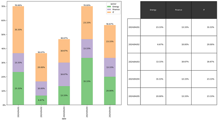
Data
Raw data
We use a simple data set of a hypothetical portfolio that contains 30 stocks from IT, Energy and Finance sectors. Assume we are trying to understand what proportion of positive-return stocks are in our portfolio for each given date also we want to see what sectors they are coming from.
Our raw data looks like below
+-----+------------+---------+----------+--------------+
|     | date       | stock   | sector   |       return |
|-----+------------+---------+----------+--------------|
|   0 | 2024/04/01 | VTK     | IT       |  0.0882026   |
|   1 | 2024/04/01 | GNK     | Energy   |  0.0200079   |
|   2 | 2024/04/01 | UHM     | Energy   |  0.0489369   |
|   3 | 2024/04/01 | PXN     | Energy   |  0.112045    |
|   4 | 2024/04/01 | HTQ     | IT       |  0.0933779   |
|   5 | 2024/04/01 | GXZ     | IT       | -0.0488639   |
...
| 147 | 2024/04/05 | YOK     | Finance  |  0.0558508   |
| 148 | 2024/04/05 | SHV     | Energy   | -0.0657954   |
| 149 | 2024/04/05 | WXP     | Energy   | -0.0230792   |
+-----+------------+---------+----------+--------------+
Reshaped data
To plot, we calculate the positive ratio and reshape the data into the below form: (This is the reshaped table in our demo code).
+------------+-----------+-----------+----------+
| date       |    Energy |   Finance |       IT |
|------------+-----------+-----------+----------|
| 2024/04/01 | 0.233333  |  0.133333 | 0.333333 |
| 2024/04/02 | 0.0666667 |  0.1      | 0.2      |
| 2024/04/03 | 0.133333  |  0.166667 | 0.166667 |
| 2024/04/04 | 0.333333  |  0.133333 | 0.233333 |
| 2024/04/05 | 0.2       |  0.133333 | 0.233333 |
+------------+-----------+-----------+----------+
Reshape Code
To reshape raw data to above data table, we run below code. In below case, data i
reshaped = raw.pipe(lambda x: x.assign(posRet=x['return']>0))\
    .groupby(['date', 'sector']).agg(numPosRet=('posRet','sum'),numStocks = ('stock', 'count'))\
    .pipe(lambda x: x.assign(numStocks=x.groupby('date')['numStocks'].transform('sum'))) \
    .pipe(lambda x: x.assign(positivePct=x['numPosRet']/x['numStocks'])) \
    .reset_index() \
    .pivot(index='date', columns='sector', values='positivePct')
Plot
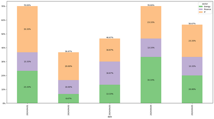
Below is the code to code to generate above plot
import pandas as pd
import matplotlib.pyplot as plt
import seaborn as sns
import matplotlib.ticker as mtick


# Code to get your raw data and reshape your data comes here
# Code below assumes the reshaped table is already prepared

fig, ax = plt.subplots()
reshaped.plot.bar(stacked=True,
               figsize=(20,10),
               ax=ax,
               color = sns.color_palette("Accent", n_colors=3))
for c in ax.containers:
    labels = [f'{v.get_height():.2%}' if v.get_height() > 0 else '' for v in c]
    ax.bar_label(c, labels=labels, label_type='center')
ax.bar_label(ax.containers[-1],
             labels=reshaped.apply(lambda x:f'{sum(x):.2%}', axis=1))
ax.yaxis.set_major_formatter(mtick.PercentFormatter(1.0))
Break down
Plot bar chart
We use plot.bar function of pandas dataframe to create the bar chart. The argument stacked is where we tell the function to plot stacked bars.
Generate subcategory labels
Then for each stacked area, we store its label and use ax.bar_label function to add labels to each stacked bar in our plot.
Generate category labels
We then set the label for each of the entire bars with the first line and set the y-axis label to percent format with the second line.